The expirations chart provides an easy way to select a target trade expiration based on option-centric metrics for a stock. For example, some option investors prefer to sell covered calls for periods of peak implied volatility in order to maximize the premiums. Other investors may look for significant variation between the future implied volatility and historic volatility of a stock to identify periods of relative strength or weakness.
The horizontal axis of the chart is measured in calendar days. Each vertical yellow bar represents an expiration date for the options for this stock. If you click one of the bars, it will begin the trade search. By default, the next 180 days are shown, but you can select expirations that are further out from the dropdown list, which will update the chart to include it.
In addition to the expirations, upcoming earnings announcement and/or ex-dividend dates are shown with dashed lines. These dates are very important for options investors as they often have a meaningful impact on the price and/or volatility of the stock.
It’s easy to show or hide a variety of option indicators to get a feel for their relative values over the term shown. Note that all of the vertical axis data is based on EOD calculations from the previous trading day.
Historical and implied volatilities
Some of the most common indicators option investors rely on are historical volatility and implied volatility.
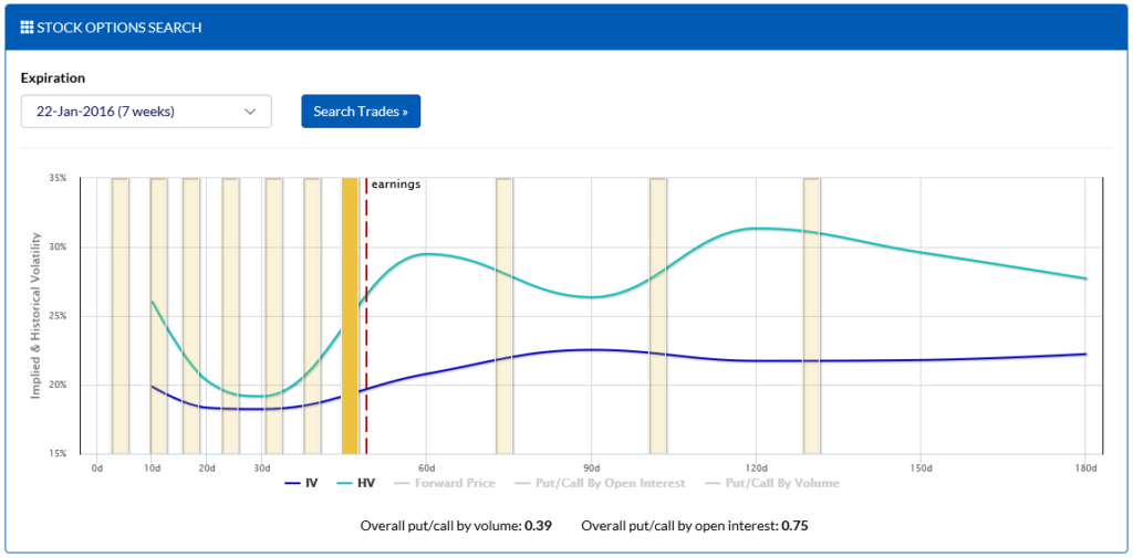
In the chart above, you can see that the implied volatility (blue) is significantly below the historical volatility (turquoise) for the target stock for the terms shown. This is an indication that the market does not expect the stock to move as much as it has in the past. It’s important to always keep in mind that the implied volatility is based on future terms, whereas the historical volatility is measured from past terms. As a result, a given term, such as “30d”, shows the 30-day future implied volatility vs. the 30-day realized historical volatility.
Forward prices
Another valuable indicator for modeling expected performance in a given stock is its forward pricing.
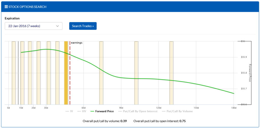
In the chart above, you can see that the forward price (green) of the stock slowly declines every three months or so. This is due to the fact that the stock offers a dividend, which slowly leaks value from the stock. Since options do not offer dividend benefits, the price leakage is a key factor when considering how to model the price of a stock at a future date. In addition, the forward price can expose significant concerns with the underlying, such as if it is experiencing heavy short pressure. Stocks with significantly bearish sentiment will often have a forward price that is drastically below its current price, even for the immediate term.
It’s important to note that since the forward pricing is measured using EOD data from the previous trading day that you should not directly compare it with the current stock price. For example, if the stock closed at 100 yesterday, the forward prices for a healthy stock would typically be around 100 (minus future dividends across the terms). However, if the stock then opened up significantly today (such as due to a great earnings announcement after hours yesterday), the current trading day’s movement should be taken into consideration when reviewing the data.
Put/call ratios
Two more indicators that are useful for modeling expected performance in a given stock are its put/call ratios by volume and open interest.
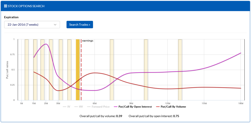
In the chart above, you can see that the volume-based put/call ratio (red) indicates that the most recent trading day’s options volume heavily favored calls over puts across all terms leading up to 180 days. However, when measuring by open interest (purple), those holding contracts after close have a more neutral view over the next 20 days, as well as when the term approaches 180 days.
In addition, the overall put/call ratios by volume and open interest (which include all options across all terms weighted equally) are shown at the bottom of the chart.
IV Rank & IV Percentile
IV Rank and IV Percentile are analytics that provide insight as to how the current implied volatility compares to historical implied volatility for comparable terms over the past year.
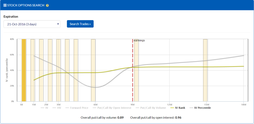
In the chart above, you can see that the 10d IV Rank is at 30%, which means that its current 10d IV is 30% of the way between its low and high for the past year. For example, if the 10d low had been 20% and the 10d high had been 50%, then a current 10d IV of 29 would produce an IV Rank of 30%.
The IV Percentile shown follows the same concept as IV Rank, except that the percentage indicates the percentage of days where the comparable term’s IV was below the current IV over the past year. In the example above, the current 10d IV being around 60% indicates that 60% of the 10d IVs over the past year have been below the current 10d IV.
If the 10-day IV Rank is 30% and the IV Percentile is 60%, it’s an indication that the 10d IV has historically been below the current 10d IV on most days, but that the high values tend to spike higher relative to the mean relative to the low drops.